The Life Color Plus Shade Chart Explained: Depth, Tone, Toners and Superlighteners
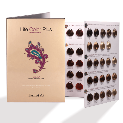
Every professional colour range is a code, and once you can read the code you can formulate in it without memorising a single shade. This is how the Life Color Plus numbering works — depths, reflects, the naturals, the correctors, the toners and the superlighteners — and how to find what you need inside 160 variants.

The two-part system
Life Color Plus uses the international depth-and-tone convention that most European colour houses share. Every code is two pieces of information separated by a point:
7.43
7 — the depth. How light or dark the result is.
.43 — the reflect. The tone, and its secondary tone. The first digit after the point is the dominant one; the second modifies it.
So 7.43 is a level 7 with a copper dominant and a gold secondary. Change the first digit and you change the depth; change what follows the point and you change the tone at the same depth. That is the whole system.
The depth ladder
Depth runs from black at the bottom to the lightest blondes at the top. In this range it climbs from 1 to 10 through the standard series, and then continues into a 12 series for the high-lift shades.
| Depth | What it is |
|---|---|
| 1 | Black |
| 3 | Dark brown |
| 4 | Brown |
| 5 | Light brown |
| 6 | Dark blonde |
| 7 | Blonde |
| 8 | Light blonde |
| 9 | Very light blonde |
| 10 | Lightest blonde / platinum |
| 12 | High-lift series — see below |
The reflects
The digits after the point are the tone. Life Color Plus follows the international convention, which is the same framework Wella and L'Oréal use even though the specific pigments differ:
| Reflect | Family | Example in this range |
|---|---|---|
| .0 | Natural | 6.0, 7.0, 8.0 |
| .1 | Ash | 6.1, 7.1, 9.1 |
| .2 | Violet / irisé | 4.20, 5.20, 10.21 |
| .3 | Gold | 7.3, 8.3, 9.3 |
| .4 | Copper | 7.4, 7.44, 8.4 |
| .5 | Mahogany | 5.5, 6.5, 10.5 |
| .6 | Red | 6.66, 7.66, 8.66 |
| .7 | Brown / mat | 5.7, 7.7, 9.7 |
The framework is shared; the pigments are not. A .1 is an ash in every line that uses this convention, but one house's ash is bluer than another's. Use the table to navigate the range — use the printed chart, and a strand test, to know what a specific shade actually does.
Doubling the digit intensifies it
You will see shades like 7.44, 6.66 and even 6.666. Repeating the reflect digit signals a more intense version of that tone. A 7.4 is a copper blonde; a 7.44 is the same depth with the copper turned up. This is how the range gives you vivid coppers and reds without adding extra depths.
The same logic applies at the natural end: .00 is an intensified natural, used where a plain .0 would not hold. That matters most on heavy white — see the grey coverage guide.
The naturals
The natural series is the backbone of the range and the shades you will reorder most. There are four variants at most depths, and they are not interchangeable:
- .0 — the standard natural
- .00 — intensified natural, for resistant hair and heavy white
- .03 — warm natural, keeps the result from going flat
- .07 — natural with a cooler cast, for clients who will not tolerate gold
They run from depth 4 up to depth 10, which covers effectively every base you will formulate on.
Correctors
Three correctors sit at the top of the range, coded from zero depth because they carry tone and nothing else:
| Corrector | Tone |
|---|---|
| 0.22 | Violet |
| 0.44 | Copper |
| 0.66 | Red |
They are for pushing a formula rather than being a formula — adding warmth back into a shade that would otherwise land too cool, or intensifying a reflect on hair that historically eats it. Quantities come off the chart, not off instinct.
The toners
Six pure toners sit outside the numbering entirely, listed by colour rather than by code: Pink, Red, Violet, Blue, Green and Yellow.
These are the shades for fashion work and for neutralising on pre-lightened hair. Green against red, violet against yellow, blue against orange — standard colour-wheel neutralisation, using a professional pigment rather than a purple shampoo and hope.
Superlighteners: the 900 and 12 series
At the top of the range sit the high-lift shades, in two families:
- The 900 series — 900, 901, 902, 903, 911, 912
- The 12 series — including 12.0, 12.1, 12.08, 12.11, 12.12, 12.16, 12.21, 12.43, 12.61, 12.81, 12.89, and several dual-coded shades such as 12.021, 12.022 and 12.122
These are lifting products, not deposit products, and they behave differently from the rest of the range. They are the shades the developer table pairs with 30 or 40 volume for four to five tones of lift, over a 40–45 minute development. They also work best on a base that is already reasonably light — asking a superlightener to do a bleach's job on a dark base is the classic way to get an orange result and blame the colour.
The superlighteners do not use the standard ratio.
Where the rest of the range mixes 1:1.5 — 50ml of colour to 75ml of developer — the super-bleaching shades mix 50ml of colour to 100ml of 40 volume (12%). That is a 1:2 ratio, and it is the single most common mistake made with a high-lift series. Mix them like a normal shade and you will not get the lift.
Using the system: three worked examples
The point of understanding the code is that you stop searching the chart and start navigating it. Three common consultations, formulated by reading rather than remembering:
"I want to stay the same, just cover the grey"
Establish the depth she is currently sitting at — say a 6 — and the percentage of white. Above 50%, the formula is half of the target reflect plus half of the natural at that depth. If she wants no warmth showing, reach for the 6.07 rather than the 6.03 as the natural. Full protocol in the grey coverage guide.
"Something warmer, but not red"
You are moving along the reflect axis, not the depth axis. Same depth, change what follows the point: a 7.0 client who wants warmth goes to 7.3 for gold, or 7.43 if she wants a copper lead with gold behind it. Neither changes how light she is, which is usually what she means by "not too different".
"Brighter copper — it always goes flat after a fortnight"
This is a job for the doubled digit. Move from 7.4 to 7.44 for a more intense copper at the same depth, and consider the 0.44 corrector to push it further on hair that historically eats warmth. If she is more than half white, remember the mix still needs a natural in it or the copper has nothing to sit on.
What to stock first
160 variants is a range, not a shopping list. If you are stocking this line from scratch, the shades that earn their shelf space first are the ones you reach for every day:
- The naturals, depths 5 to 9 — the .0 series is the backbone of nearly every grey formula you will mix
- A second natural at your two most-used depths — a .00 for resistant heads, or a .07 if your clients skew cool
- Your three most-used reflects at the depths you actually work at — for most UK columns that is an ash, a gold and a copper
- One violet toner for neutralising on pre-lightened work
- 20 volume developer, in quantity, because almost everything above uses it
Add the correctors, the fashion toners and the superlighteners once you know which way your column pulls. Buying the whole range on day one is how stock ages on a shelf.
Which chart to buy

Two formats, and most salons want both:
- The large salon chart — the full range, for the consultation area. This is the one clients point at.
- The mini chart — the portable version, for mobile work and for the colour bar.
- The chart enlargement — additional swatches to extend what you already have.
A physical chart is not nostalgia. Screens render colour according to their own white balance and brightness, so a client choosing a shade on a phone is choosing something nobody can guarantee. A swatch under salon lighting, held against the hair, is the only consultation tool that does not lie.
Explore the range
160 shade, corrector and toner variants, all at £3.49 a 100ml tube.
Browse every shade →
The full salon shade chart →
The whole Life Color range →
Part 3 of 5 — Life Color Plus in the salon.
Previously: ← 100% grey coverage: the exact formula
Next: Switching from Koleston or Majirel →
Shade availability and prices as listed on lifecolorplus.co.uk at the time of writing. Life Color Plus is a professional product for salon use only — always work to the manufacturer's current instructions and shade chart.
-
Posted in
colour theory, Life Color Plus, shade chart, technical, trade